Product Launch
Driving speed-to market & consistency with a Scalable Design Toolkit.
Staples, INC.
Don’t just design. Build systems to help everyone achieve.
How do we deliver
quality content quickly?
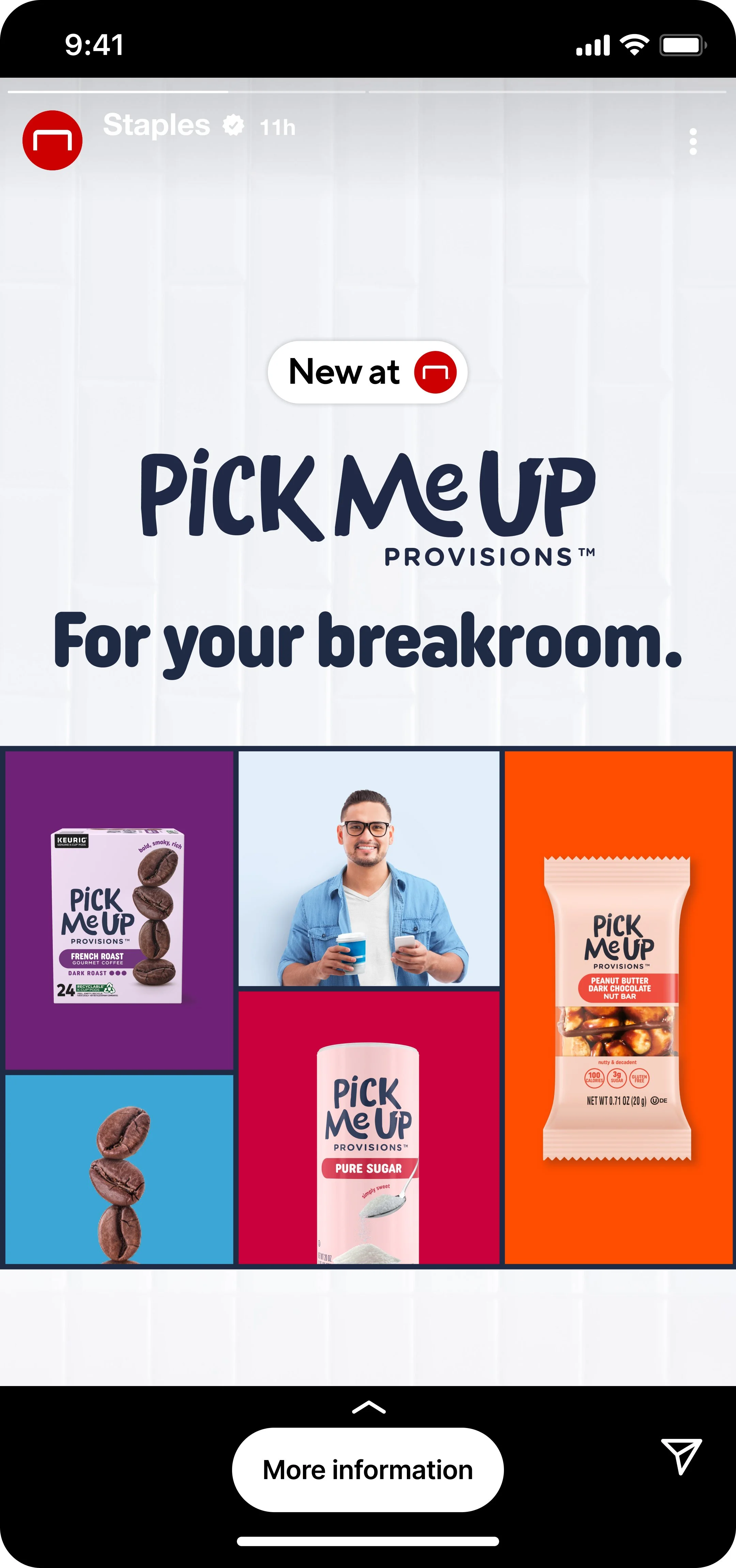
The Pick-Me-Up Provisions™ launch was BIG… and it came out of left field. Our Private Label brands are a cornerstone of the Staples Growth Strategy. Our small but strong creative team had to work fast to meet customer needs and show our reliability to many different stakeholders, so…
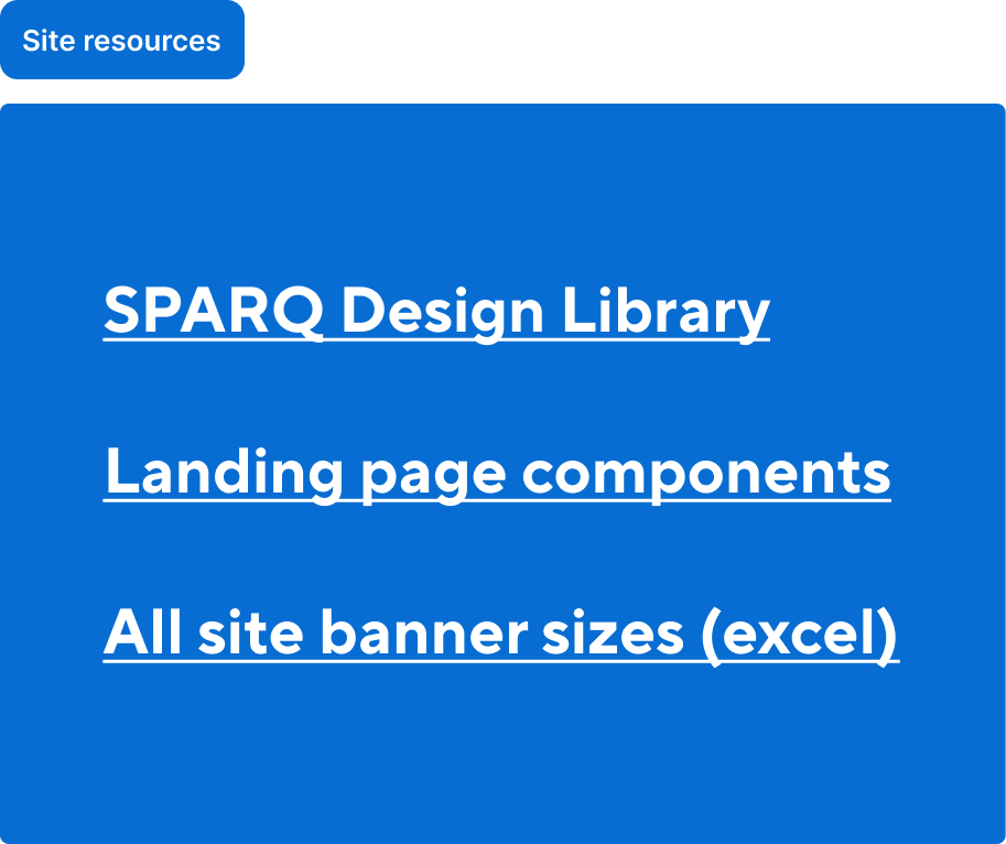
File Architecture: Create a structure that allows for designers to jam on their work how they need to, without sacrificing quality and ease of oversight.
Flexible Creative Components: Design a reusable creative toolkit that allow for ease of use, locks in the look, but allows for flexibility.
Get people what they need: Refine the proof process in partnership with the Project Management team to help minimize back-and-forth with external stakeholders.
Easy architecture
While our ACDs of copy and design collaborated with the Creative Director, the Private Brands team, and Staples Leadership to set the direction, I focused on preparing the file. I created workspaces for our team, providing design and copy the resources to execute and easily review work once the direction was clear.
Organized pages to provide a home base for each designer's work.
Added resource and reference sections to help designers and copywriters handle brief issues or quick changes.
Included in-situ proofing sections for easy review with the business and consistent formatting for all designers.
Did you know: “Get it done.” is one of Staples, INC. values?
Systematic aesthetic
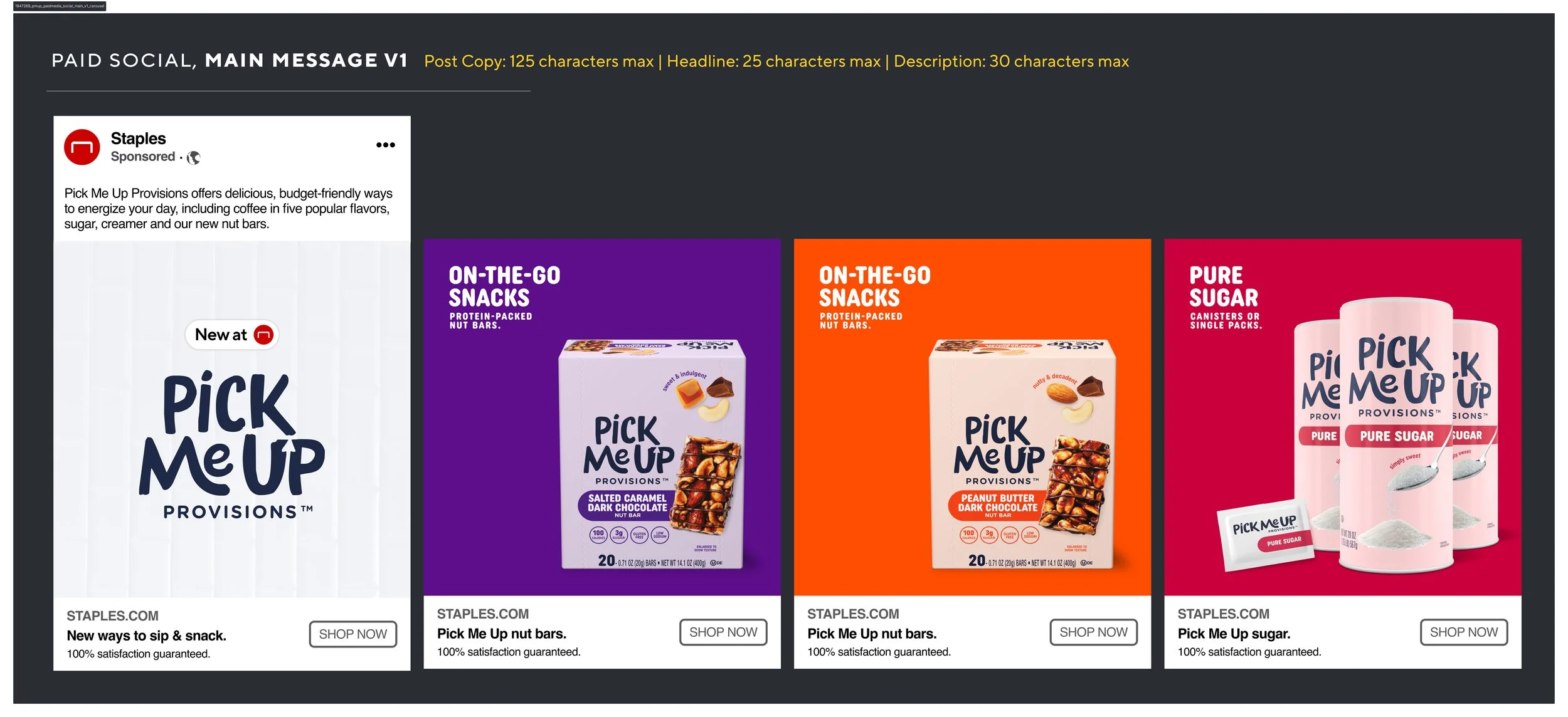
We built a detailed component library to help designers work faster and keep designs consistent. This approach also allowed us to update on the fly as things changed.
Created text and color styles for designers to make quick adjustments to their creative that were in-line with the Pick-Me-Up Provisions branding.
Built adaptable design components that could be adjusted and resized to fit in numerous placements and customer verticals.
Staples Value?: “Keep it simple.”
Help others see the vision
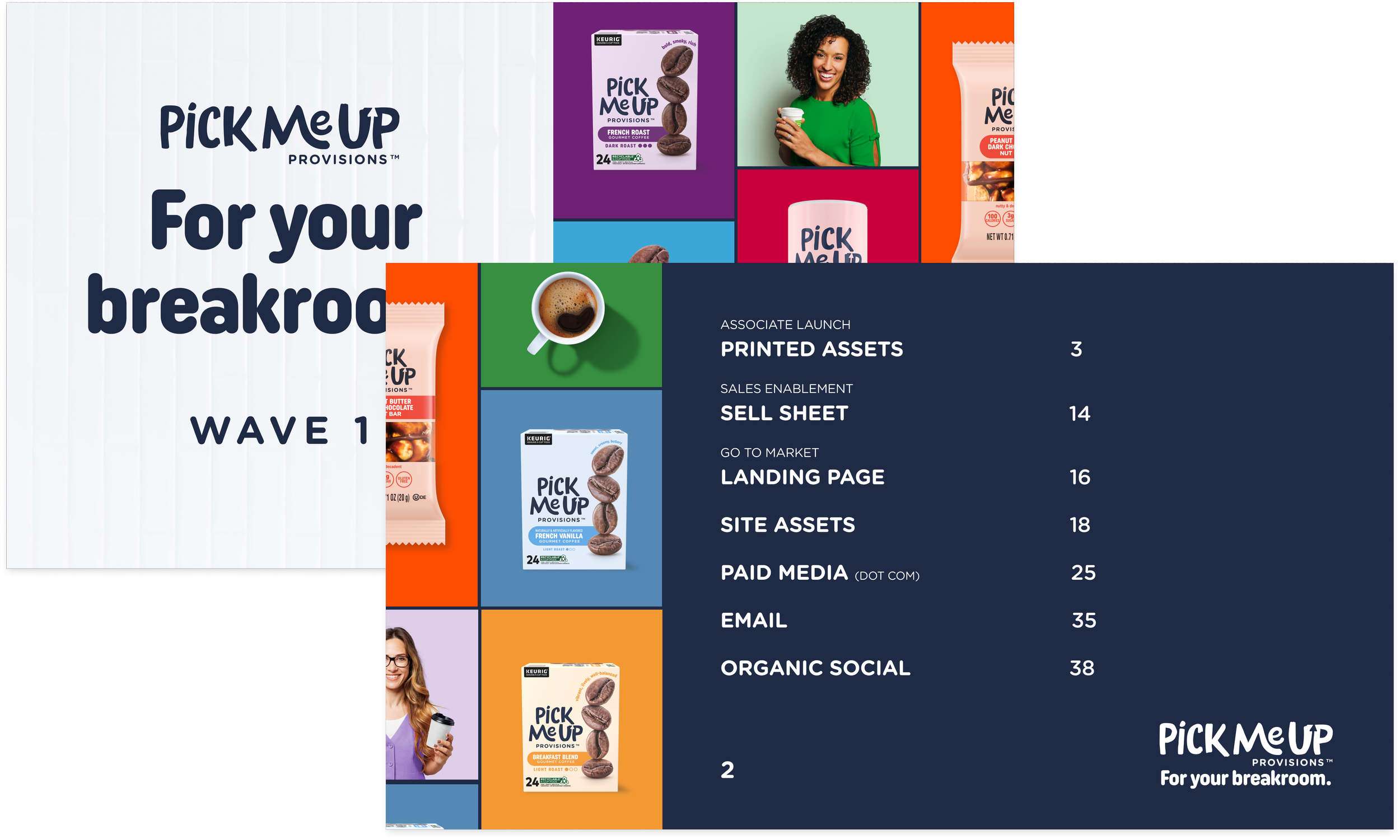
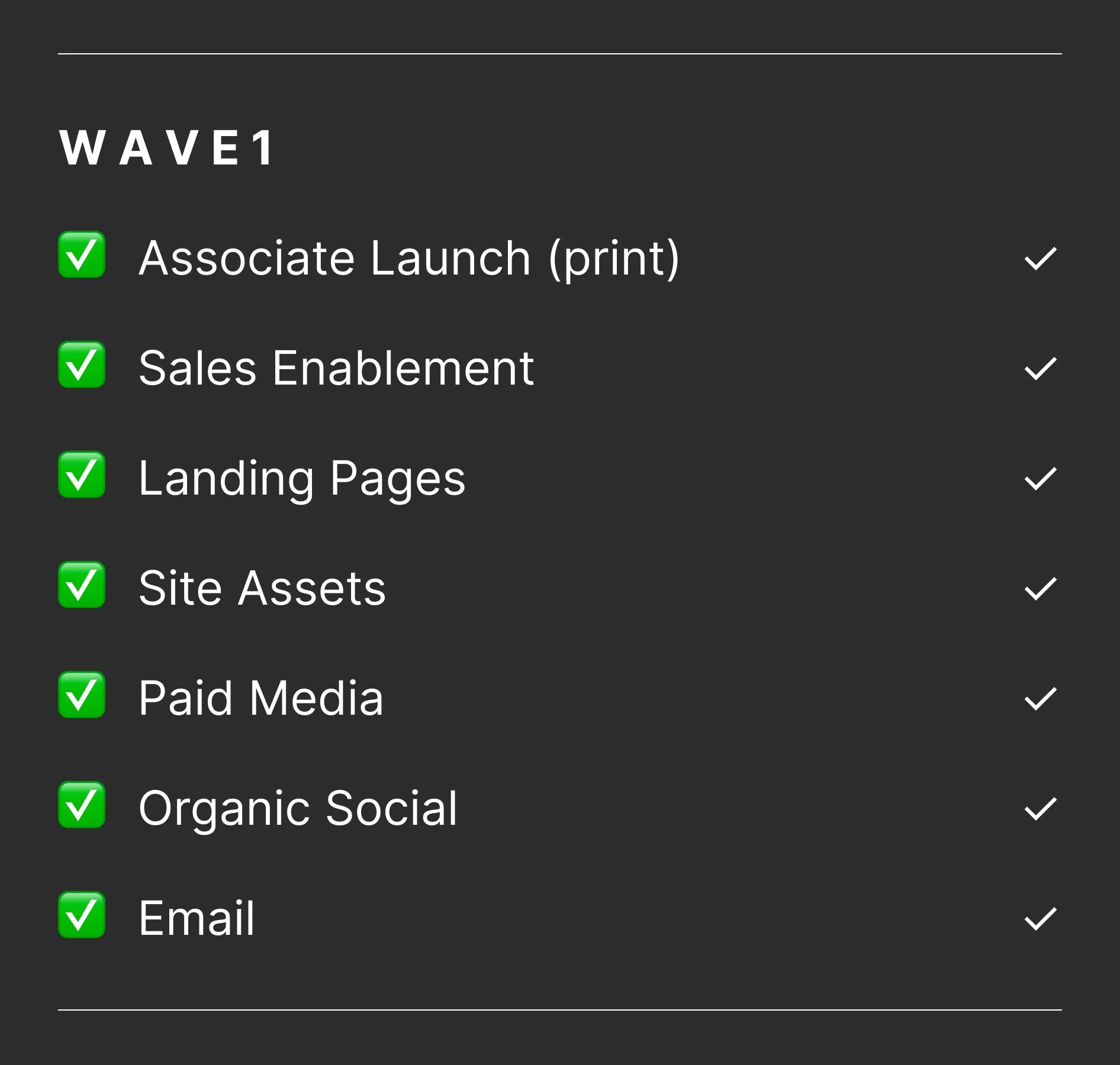
Stakeholders have varied needs, and this was our first job with this many assets. I teamed up with project management with a last minute idea… to split the Workfront proof into concept, design, and production phases.
We added a table of contents and title pages to help our partners quickly navigate the file. The extra design to make it look nicer wasn’t essential, but I saw it as a chance to apply the final branding, strengthen the direction, and demonstrate our team’s reliability.
Staples value? “Win Together.”
How’d it go?
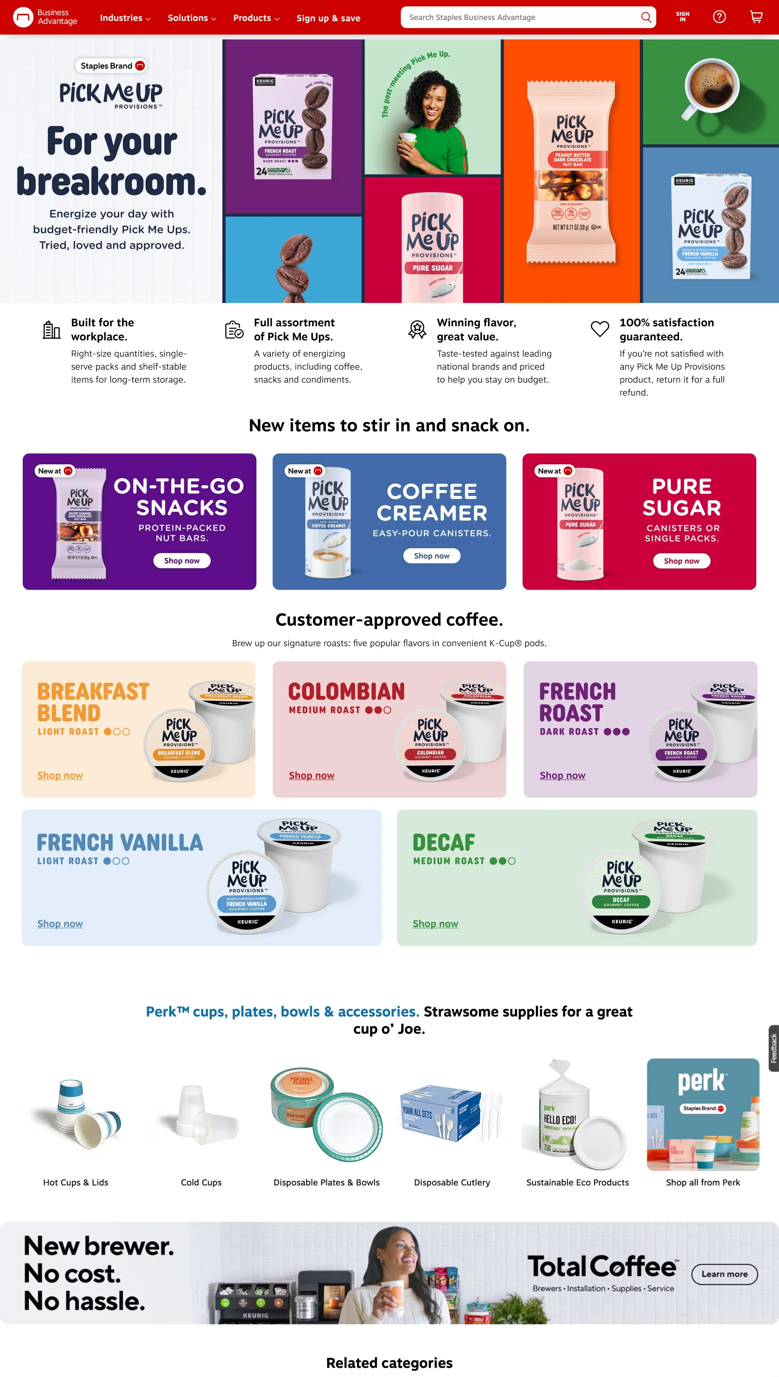
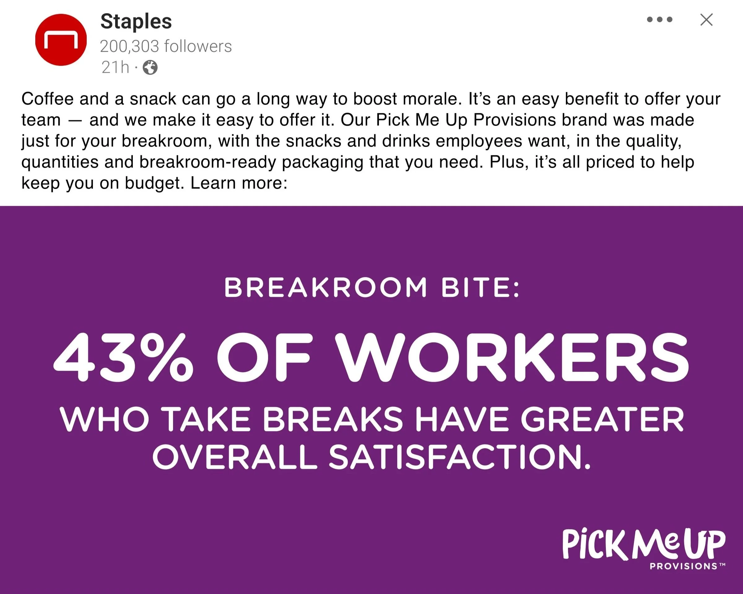
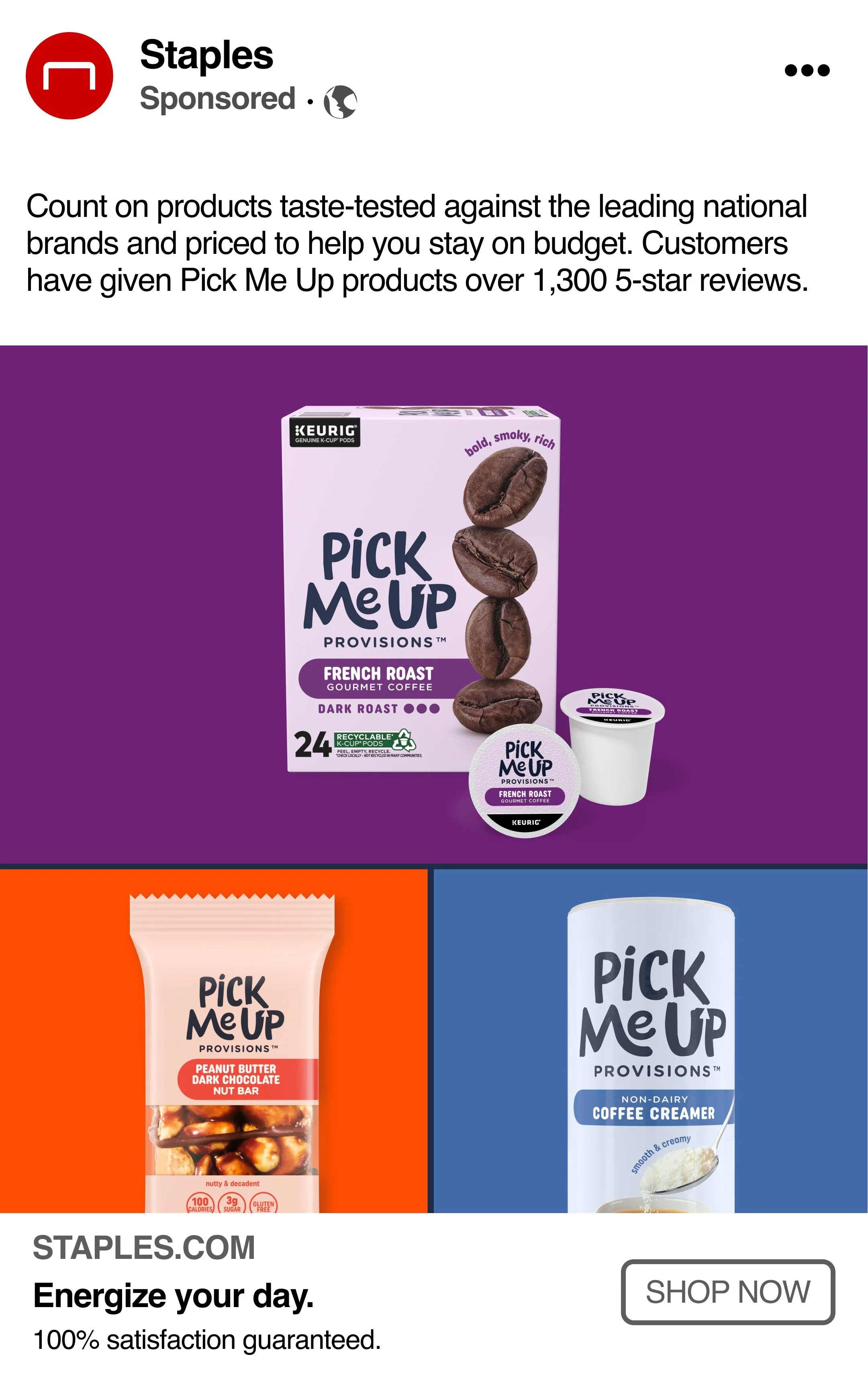
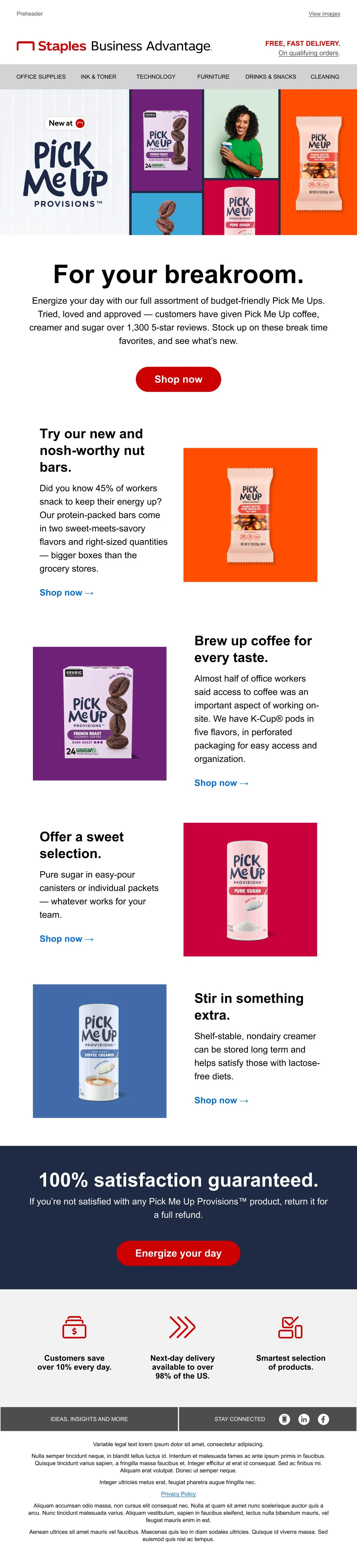
The Pick-Me-Up Provisions™ Launch was one of the most successful launches to date. Our internal partners were fully equipped to launch across numerous touch-points — paid media, video, print, site, and social.
Our team was well equipped with everything we needed to meet the tight deadline, while ensuring visual consistency across all media types, and customer verticals.