Brand redesign
Aligning brand look and feel with musical, connective vibes
Spec Work — 2018
Revitalize a local spot blending to showcase it’s vibrant energy.


Understanding the Existing Brand:
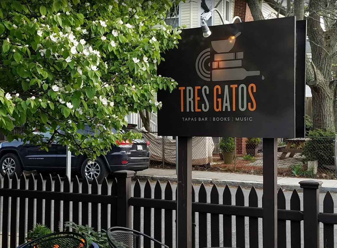
Tres Gatos' previous branding, while informative, lacked the essence of the lively atmosphere I encountered. It relied heavily on imagery of food, drinks, books, and records, falling short of capturing the "jazzy rhythm" of the dining and record store experience.


Design Inspiration and Exploration:
I wanted to add energy, inspired by Saul Bass’s motion and style. I used mid-century Spanish design for the look. Instead of color rhythms like the original (maybe inspired by a Miles Davis record), I used the structure of sheet music to show movement.
Expressing the Experience:
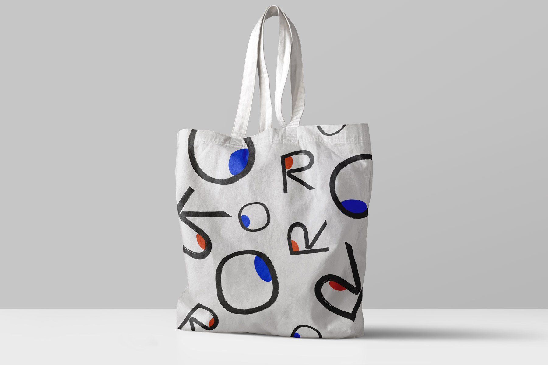
Connecting with others is key to Tres Gatos. I added some expressive "eyes" to the design to show the connections made through shared moments.


The New Tres Gatos Identity:
The new design is full of lively, jazz-like energy. The logo shows the letters "R" and "O" with connected pupils, symbolizing first meetings and friendly gatherings.
Menus that Add to the Experience:
The menu does more than list items. It uses design to highlight special dishes like Paella. The drink menu has a clever flap that makes exploring drinks fun. This fits Tres Gatos' playful vibe and invites people to interact with the menu.
More Than Just a Logo:
The branding also includes business cards, a tote bag for the record store, and seasonal mixtapes that match menu changes.
This fresh look captures the spirit of Tres Gatos—a lively place for great moments and connections.
Early Website Exploration:
This project also involved creating a website for Tres Gatos. While aiming to capture the restaurant's vibrant energy, my design approach at the time leaned more towards experimentation and personal style. This was due to my limited experience with user experience (UX) design principles.
In hindsight, I would prioritize a user-centric approach, focusing on streamlining the online ordering process and optimizing the overall website experience. This shift in focus would reflect the growing importance of convenient takeout and delivery options, especially in the post-pandemic landscape.

They still have their legacy branding, but it’s still the best damn restaurant/book/record store in Jamaica Plain (and probably…anywhere?)