Email Design System
Streamlining the Workflow and Transforming Customer Experiences
Staples, INC — 2022-2023
Creating emails at Staples was hard…The old system used desktop-only images, hindering screen reader access. Our smaller creative team had limited resources and time. The focus on images led to frequent redesign requests, causing confusion and inconsistent branding, so…
How do we reimagine email to account for usability, accessibility, and flexibility?
Identify and communciate the issues: Connect Customer Marketing, Marketing Operations, and Creative teams with clear rules, and explain why these changes are needed.
Create reusable components: Build a library of reliable parts that can be mixed to create emails easily. Aim for a simple 80/20 balance between ease of use and flexibility.
Standardize templates: Make fixed templates for routine email campaigns to reduce custom work. Refocus the teams on special projects.
Working towards our common goals

In collaboration with Creative, Marketing Ops, and Customer Marketing leaders, we identified the primary issues the teams faced. We agreed to model our new library from industry and ADA best practices.
Custom email themes and no templates caused delivery delays and frequent rework.
Image-only emails were unusable for people using assistive technologies.
The utilization of rich text would allow Customer Marketing to personalize and target different customer verticals with similar messaging.
Create the building-blocks
I collaborated with Marketing Operations and agency email developers to create key starting elements. We balanced budget and development time limits. Our modular requests were based on market research of similar retailers, focusing on usefulness.
Created a dynamic library of modules that were set up for ease-of-use, flexibility, and easy production.
Focused on dividing our assets into clear “transaction” parts and “storytelling” parts.
Specified exact character limits, fonts, and colors to avoid confusion for designers and marketers.
Standardize the business as usual

Over time, we teamed up with Customer Marketing to create main regular email themes. We used an 80/20 design rule to limit changes but keep emails fresh.
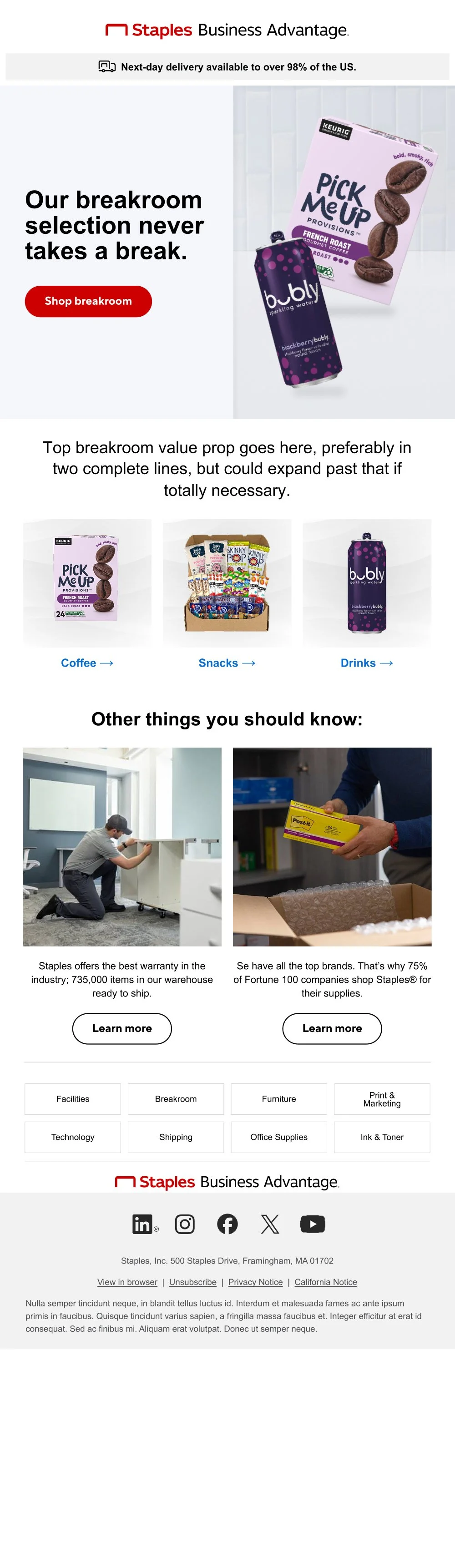
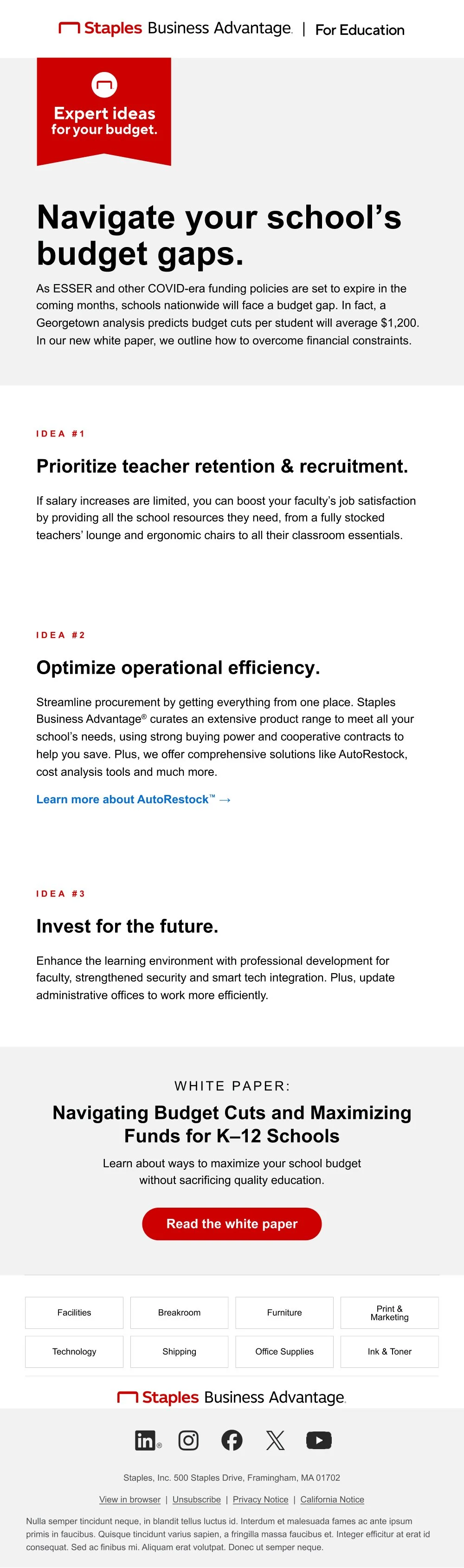
Developed email templates for content, shopping, experts, product reviews, product launches, etc.
Built a shared library for designers and copywriters to access email templates easily for build-out.
Worked with Customer Marketing to maintain and govern the library, culling and adding as needed.
How’d it turn out?
We cut design and development time by 20%, and reduced swirl significantly. This reduction in development, and focus on accessibility also allowed Marketing to execute personalized content, increasing the efficacy of our communications. Additionally, with the reduction in dev time and swirl, we were then able to take on additional work. Opening up the door for more opportunity.